Sunday, May 20, 2012

84% Annular Eclipse - What fun!

What fun to (indirectly!) watch the solar eclipse today. The image was not nearly as stunning as the photos I've seen of the full annular eclipse, such as the sunrise in China. Nevertheless, it was great fun. We went to Shoreline Park, in Mountain View, California where we set up a tripod with binoculars projecting onto white cardboard:


Around 6:20pm - To see the image better, we created a shadow on the cardboard by holding the binocular case above and behind the tripod.


Our friend, John, held the cardboard - and in this case, a visor to add  a shadow. You can see the binoculars taped to the tripod. what you may not notice is that the binoculars are BACKWARDS (a recommendation from a passing stranger; worked nicely!)


Around 6:30pm we had the maximum eclipse for our region, purported to be 84% according to the Exploratorium Museum.
Want to learn what an annular eclipse is all about? Check out the article published by the Exploratorium, one of my favorite science museums on the planet (well worth a visit next time you're in San Francisco!)


Saturday, May 5, 2012

Supermoon - Wow!

Speaking of night photography, it seems that everyone with a camera was out tonight to see the "supermoon" (described nicely by NASA). The nice thing about the timing from a lighting perspective is that the moon was rising as the sun was setting, so for a few minutes the contrast was not too extreme.

What a sight...

Supermoon rises over Moffet Field (as seen from Shoreline Park, Mountain View, CA, USA)


The finale for me was the scene over Shoreline Park's lake, facing west - a clear view of Venus and its neighbors:


Look carefully and you can see 5 stars beginning to emerge:
  • Elnath (closest to Venus)
  • Ahena (near the left margin, above Venus)
  • Betelegeuse (along the left margin, below Venus)
  • Bellatrix (below Betelgeuse)
  • Adlebaran (almost directly below Venus, barely seen in the fading sunset)

Screen capture from one of my favorite apps, "Starmap" by Frederic Descamps

Night Photography - Always an Adventure

Above the rising moon (hidden by the tree), Saturn (center), Spica (to the right), and the beacon trail of a passing airplane (f8 8sec ISO400 70mm)

I've always been intrigued by night photography, and with a digital camera (and tripod), the experimenting is great fun (vs. hugely frustrating, as in the days of film). The meter is nearly useless but the possibilities are endless. You don't have to go anywhere exotic - you just need some great weather.

The view from my suburban driveway, despite the sodium vapor streetlights, is still quite interesting. Last night, I could see three planets - Saturn (rising), Mars (high in the sky), and Venus (setting), all between 9:30-10pm.

Looking West - Venus with Elnath just a few degrees higher (f5.6 10sec ISO400 126mm)

Tech Tips:
  • Use a STIFF tripod - don't extend the legs or any tubes to full length
  • Use a remote shutter release, or to save money, just use the self-timer (my camera has a choice of a 2s or 10s delay)
  • Lock the mirror up before shooting, if your camera has that feature. My camera lets you view through the viewfinder (like a film camera), or you can lock the mirror up and view through the preview screen on the back. This latter mode is nice because you can zoom in digitally to see if things are in focus.
If you enjoy night photography and have any additional tips or successful shots, I'd love to hear (and see) them!

Thursday, February 9, 2012

My First Calibration - Partial Success?

My Spyder3Elite arrived today! Not a day too soon...

In lieu of a long step-by-step rundown of the "out of box experience", let me just say it was easy, a tad time-consuming, well worth it, but not perfect. Here's what I was trying to do:

I have my laptop (on which I run Adobe Lightroom) attached to a desktop monitor as a "proofing" screen. In Windows parlance, I'm running two monitors using "extended desktop". The primary monitor is my laptop, and the proofing happens on the extended desktop (large monitor on my desk). The two images used to be hopelessly not similar. Now they are tolerably almost similar, and I think I can trust the desktop monitor once again.

My Spyder hanging on my desktop's monitor
(ignore the gold cast - it's a function of my phone's lousy white balance)


Here's what I learned:

  • Michael Riechmann and Jeff Schewe were absolutely right - you can't do anything serious related to color when using a laptop's monitor. Not only does mine have a HUGE difference in apparent luminosity depending on vertical viewing angle (the tilt of the screen), but its "gamut" is not sufficient to fully represent the sRGB color space! My desktop monitor, on the other hand, covers sRGB reasonably well.

Note how the red plot (my desktop monitor) matches the green sRGB plot
...but the laptop's monitor falls well short

  • My first attempt at calibration didn't get both monitors to look the same. When I tried "recal" in a workflow that was designed to match the two, it came closer - but not perfect. Perhaps this is due to the difference above - my little laptop monitor is trying as hard as it can to reproduce reds, but is failing - so the desktop more accurately displays the red tones.
  • If I want to do any SERIOUS color prep for fine art prints, then I'd better save up to buy a really good monitor that can cover the AdobeRGB (or better) color space - otherwise, I'll never know what I'm adjusting and the prints will be hit or miss.

The next experiment, of course, is to see how well all of this matches print output at my favorite lab. THAT part of the "colour" management workflow I haven't studied enough yet (how do I tell Lightroom what the printer's profile is when I'm not printing directly?). Stay tuned...


Monday, February 6, 2012

Calibrating My Monitors

I have a confession to make: I have never calibrated my monitor. I guess I was just lucky - but my luck ran out when I recently got a new laptop...

When you have nothing to compare to, you don't know how much trouble you're in. Every once in a while I'd get prints back that looked quite a bit different from what I recalled seeing on screen, but I didn't think too much about it - until I got a new laptop. The difference between what I'm seeing on the laptop and what I'm seeing on the extended desktop monitor is, to say the least, stunning - and not in a positive sense.

I find I am now in a state of  "color confusion", and all my editing makes no sense whatsoever. This is, of course, the point at which all serious photographers will be smirking and thinking to themselves, "What rock have you been hiding under?"

The good news is I've decided to climb out from under the rock of color ignorance and finally learn about calibrating, profiling, color gamuts, luminosity, color spaces, and other heretofore mysteries of the professional color workflow. Here's what I've done so far:


STEP 1) Tried to find someone on the web who has recorded a half-way intelligent yet friendly technical explanation. There are many youtube videos on the subject, but I wasn't satisfied until I went back to my favorite stand-by site, 
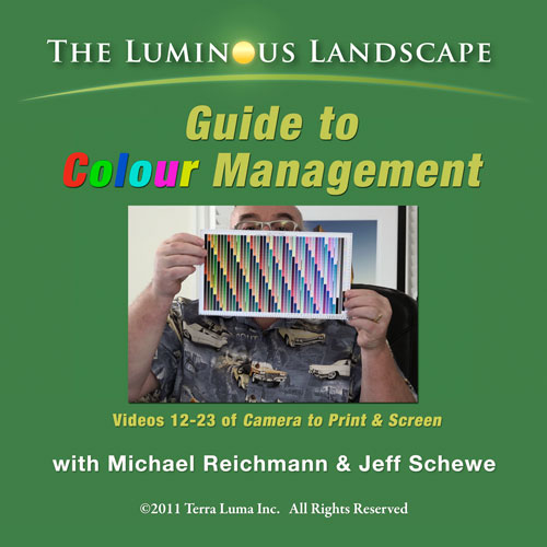
www.luminous-landscape.com - and found exactly what I was looking for. OK, it cost me $16.95, but that bought me a very entertaining set of 4 hours of instructional (and humorous) dialog and demonstration called "L-L Guide to Colour Management" featuring Michael Riechmann and Jeff Schewe.


STEP 2) I wanted a bit more on the techie side, so I found some helpful articles in Wikipedia, such as http://en.wikipedia.org/wiki/Color_gamut


STEP 3) I coughed up some cash to buy a display calibration device and software. I have no idea if I bought the BEST one, but I was certainly impressed that DataColor's Spyder products 1) got great reviews, and 2) are offering a rebate on their discontinued version 3 products, and 3) the price is dropping like a rock. So I chose a Spyder3Elite setup from B&H Photo Video - $168 with shipping, $138 after rebate (for a product that had been selling above $225). It arrives on Thursday - I'll let you know what happens.


STEP 4) In searching for a better monitor, I found a TERRIFIC professional photography blog at HP called (not surprisingly) "Professional Photography". It's FULL of great articles, including some specific to color management by guest blogger David Saffir:


...to which I now embarrassingly can say, "It's about time..."


Friday, January 13, 2012

The Pomegranate


Excerpt from "The Pomegranate"
by Alexia Vanides
28 October 1971


This poem excerpt comes from the cookbook my older sister made for me as I went off to college. This treasured, hand-crafted (and hand-typed with Courier font!) cookbook is entitled "Cheap and Good". She filled it with her recipes for surviving college - gastronomical and poetic advice for her little brother. I credit her with giving me the courage to cook with abandon, not like the engineering-minded person I used to be who was at that time more comfortable putting things in straight lines. 

Thanks, Lex, for gift of non-straight-line-thinking. I just had to celebrate by playing with some pomegranate seeds...